One of the largest U.S. manufacturers of industrial steel work platforms (mezzanines), material lifts, safety guarding, and access products has updated its logo to reflect its path to the future
Wildeck has announced the launch of its new Wildeck logo as part of the ongoing revolution of its company brand. With many creative sessions, Wildeck has selected a logo that is modern, with key elements that look toward the future.
“The new look is more aligned with the transformation Wildeck has made as a company. The traditional, block font type found in the previous logo has been replaced by a much more modern style that recognizes Wildeck as a forward-thinking and innovative solutions provider,” said Michael Troka, Wildeck’s Vice President of Marketing.
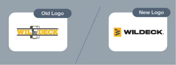
“The name will no longer be split in two, avoiding confusion with partners and potential customers identifying us as ‘Wil Deck,’ among other variations.” The mark in the new logo, while resembling a sideways “W,” includes several key abstract elements. The formation of the abstracted shapes points toward progress (Wildeck’s future) while paying homage to the threaded bolt found in its previous logo design. The abstracted shapes are broken down into three layers, symbolizing vertical growth – a common reason why customers seek Wildeck products. You may even see some of Wildeck’s products represented in this new mark (e.g. a two-level mezzanine, a
stair system).
Wildeck’s new logo will begin being phased into new and existing company assets and materials this month and will be fully integrated into the company by the end of 2024.


